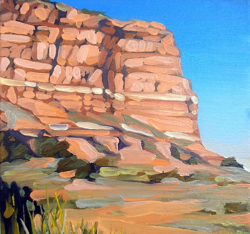
This is a small oil painting of a hot afternoon at Caprock Canyon. I've been doing a few paintings off and on of my trip there last summer (I keep getting distracted with other subjects--Texas just has so many wonderful vistas to paint!) I'm trying to work out capturing the blistering hot sunlight at Caprock in the summer when the incredibly vivid colors of the bluffs start to seem kind of bleached out. If you ever plan trip to Caprock Canyon State Park in the summertime, make sure you pack plenty of water, sunscreen, good walking shoes, and a wide brimmed hat (and the strongest bug spray you can find - the deer flies are notoriously big and love to bite!) Outside of our tent there was very little shade, especially once we started to hike up the mountains. Don't get me wrong, the canyons are beautiful anytime of year, but I think my next trip there will be in the Fall or Spring. Much cooler temperatures, and the cactus will be blooming. This painting is 8" x 10" and is oil on canvas.
Wednesday, July 27, 2011
Thursday, July 14, 2011
What's in a pallet anyway?

I'd be interested to hear what you all consider to be "must have" items for your paint box.
Friday, July 8, 2011
Texas Sky, Lake Mineral Wells (Crosstimbers Trail)

Tuesday, July 5, 2011
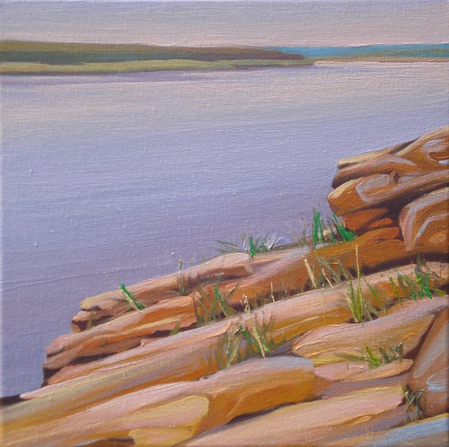
On the Rocks
Monday, July 4, 2011
Choppy Day on the Lake
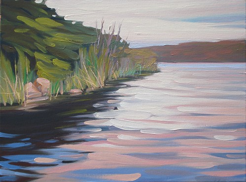
This is one of the larger paintings I've been working on lately. It's 18" x 24" and is oil on canvas. I wanted to give the feeling of those light filled, breezy days on the lake with the sounds of the waves lapping against the shore. I've tried to keep the loose, painterly feel of my smaller pieces, and have been resisting the urge to go back and clean up some of the waves. I actually went and bought a couple of larger round, bristle brushes (a 10 and a 12) to help keep me from tightening up on these larger canvases. This was painted in two main sessions, with a little additional time spent evening out a couple of transitions in the water. Kind of funny, I used to paint really large pictures (3 or 4 feet was SMALL back then), but now I'm painting smaller and smaller. When I do approach a little bigger format, I'm really aiming to have the look and feel of my smaller scale paintings. Go figure!
Wednesday, June 29, 2011
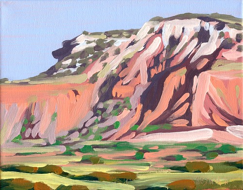
Summer at Caprock Canyon State Park
This was painted fairly quickly so the brush work is very loose. I tried to let the brush strokes themselves take the form of the rock formations. There's already so much color in the canyons that I've restrained myself from embellishing too much, trying to concentrate instead on capturing the hot, dry atmosphere.
Monday, June 27, 2011
Making the Case for Fine Art in the Classroom
The following are findings reported in Champions of Change: The Impact of the Arts on Learning (Fiske, 1999) that should be noted by every parent, teacher, and administrator:
- The arts reach students not normally reached, in ways and methods not normally used. (This leads to better student attendance and lower dropout rates.)
- It changes the learning environment to one of discovery. (This often re-ignites the love of learning in students tired of just being fed facts.)
- Students connect with each other better. (This often results in fewer fights, greater understanding of diversity, and greater peer support.)
- The arts provide challenges to students of all levels. (Each student can find his/her own level from basic to gifted.)
- Students learn to become sustained, self-directed learners. (The student does not just become an outlet for stored facts from direct instruction, but seeks to extend instruction to higher levels of proficiency.)
- The study of the fine arts positively impacts the learning of students of lower socioeconomic status as much or more than those of a higher socioeconomic status. (Twenty-one percent of students of low socioeconomic status who had studied music scored higher in math versus just eleven percent of those who had not. By the senior year, these figures grew to 33 percent and 16 percent, respectively, suggesting a cumulative value to music education.)
Along the Beach, Galveston, TX

Sunday, June 26, 2011
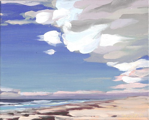
Clouds over Galveston
Time Waits for No Artist
Wednesday, February 2, 2011
The Looking Glass

We've had a freak ice storm here in North Texas, so I thought I'd fantasize about warmer days at the Lake! This is my daily painting of Lake Mineral Wells. Landscape artists are always looking for connections, and reflections in the water are a perfect way to connect the sky to the land and momentarily disrupt the horizon. This provides an overall unifying element, with the horizon only being there for variety. I often work small bits of the colors of the sky in the ground elements of my paintings for this reason, whether in pools of water or as highlights on grasses or trees. This is an 8" x 10" oil on canvas. I've never worked this small on a consistent basis before I started this series, but I'm finding it to be rather liberating and enjoyable.
Unexpected Beauty in a Roadside Ditch - NEW Water Lily Painting in Progress by Mark Nesmith
Here’s the view from my easel today. I drew up a couple of large views or water lilies from the drainage ditch past Winnie on the way to ...

-
 Like many artists these days I find myself trying to make the most of my small studio space. While I lived in North Texas I was kin...
 -
 Caprock Canyon By Mark Nesmith Oil on Canvas 12” X 16” 2020 CLICK to bid in the auction or buy it now. It’s been a few ye...