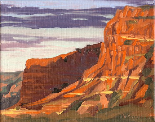
I've been water logged this week and have fallen seriously behind in uploading my paintings. I'll be working this week to try to catch up. Meanwhile, I took a little break from my series about Lake Mineral Wells and did a few paintings of West Texas. This is one of my daily paintings of Caprock Canyon, the lesser known of Texas' canyon country (most people seem to be more familiar with the nearby Palo Duro Canyon.) I actually think that in many ways Caprock has more spectacular views that are a little easier to reach. This is an 8" x 10" oil on canvas. Usually I've used pastels for my paintings of mountains and canyons because I feel the inherent texture and dryness of pastels naturally suits the subject, but I'm experimenting with a few in oils. I'm trying to let each brush stroke serve as a piece of rock or a crevice and keep the details simple. When you view mountainous regions like this its amazing how different the coloration of the rocks can be at different times of day. The cliffs at Caprock can range from deep reds to vivid oranges to yellows, all in the same day. I could sit and watch the sun rise and set on the bluffs and be perfectly content.
Saturday, January 29, 2011
Sunday, January 23, 2011
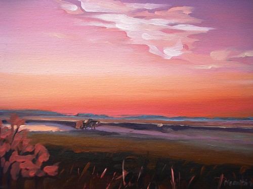
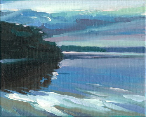
Sunrise, Lake Mineral Wells
In addition to the small daily paintings, I've also been working on some larger pieces. This is an oil on canvas and measures 24" x 30". My challenge when working larger is to keep the paint loose and fresh, and to try to maintain the slightly minimalist renditions of the small daily paintings.
Friday, January 21, 2011
New Year's Resolutions
- Paint! I've been on a roll with painting lately, and the daily painting idea really inspires me at the moment. I'm starting to have a consistent body of work again, and by this time next year I should have PILES of work (unless I've sold it all!)
- Take advantage of non-traditional exhibit venues. There's a local bank that I'm putting work together for right now. They love the idea of having a show of my work (we're working out the details soon.) There's also a high end hand-crafted furniture store that I've done lots of work with musically that I'm approaching about carrying some paintings.
- Enter Juried Exhibitions. I've made a list of a half-dozen or so of the more important ones to me and logged their entry deadlines on the calendar. I used to enter exhibits regularly back in the college days, but haven't been doing so much lately.
- Submit work to galleries. I've been keeping a list of potential galleries to approach, their submission guidelines, and dates that they review portfolios. I'm planning to make the rounds to visit several in person again and see if they'd be a good fit for me. I've exhibited in three galleries before, with mixed results. I'm trying to approach it in a more organized fashion this time around.
- Amplify my internet presence. I have a new website (http://www.marknesmith.com/), and now this blog and a Facebook page (www.facebook.com/marknesmithart). Now I'm working on what Alyson Stanfield refers to as "leaving your virtual footprint all over the internet" in her book I'd rather be in the studio! I'm working on joining some other sites and webrings to create a network with other artists and art lovers. Her book is full of practical advise to help build an art career, and alot of what I've been doing lately comes from her information. If you haven't read it yet I highly recommend you grab a copy. You can find out more about her at http://www.idratherbeinthestudio.com/
Wednesday, January 19, 2011
Frosted Fields and Snowy Delights
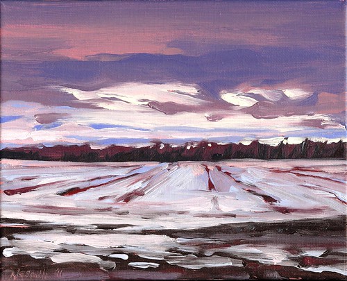
This is a scene along Malloy Bridge Road just out of Seagoville, TX. I had seen these freshly plowed fields a few days before and thought I might return to paint the rich, black soil, but today the top soil had a light frosting of snow. The clouds and dramatic light breaking through almost made the world look like it was turned upside down. I painted this scene rather quickly, with loose brush strokes and a bit more paint than I've been using lately.
The first thing to know about snow is it isn't white. I know to some of you I'm stating the obvious, but snow (like anything that appears to be white) is very reflective and bounces back the colors around it. As I gazed at the snow covered field, I saw bits of bluish white, very light pinks and purples, and some parts that were warmer, even approaching a light tint of yellow. The trick is to balance all of these tints with enough contrast to make them appear to be white. I first learned about painting whites by putting a roll of toilet tissue in a colored box covered in different colors of construction paper. With a spotlight on the roll of tissue, the reflected colors are easy to spot. It's a little more difficult out in the open in a field, but the different colors are still there. Monet painted a series of snow covered fields and haystacks that have wonderful variations in light tints, and I highly recommend studying his works. The other part of making snow stand out is to balance all of those light tints with contrasting darks. The line of trees in the distance and the muddy water holes in the foreground make the snow appear lighter to the eye, and the deep blues and reds in the sky add midtones to round out the values. The object doesn't provide the color, the light does, and if you judge your values well you can use just about any color you want. It's all about balance.
I'm keeping my fingers crossed for more snow this year, but it's getting back into the fifties this week so there's not much chance of it here. Maybe you'll have better luck!
Tuesday, January 18, 2011
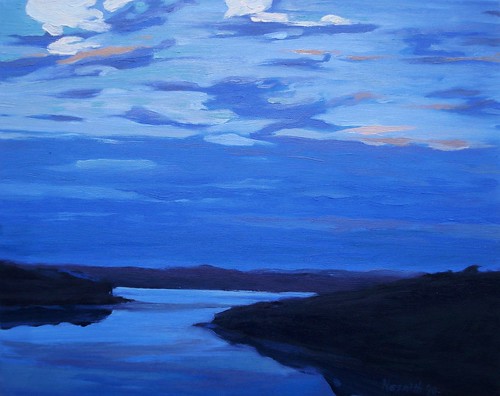
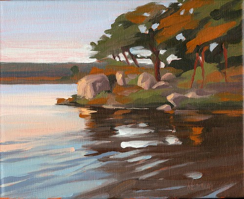
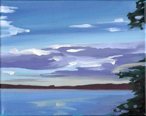
Dusk
Monday, January 17, 2011
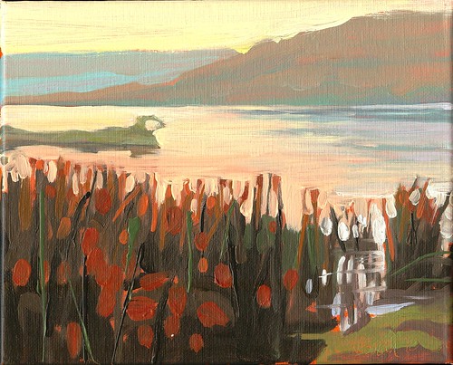
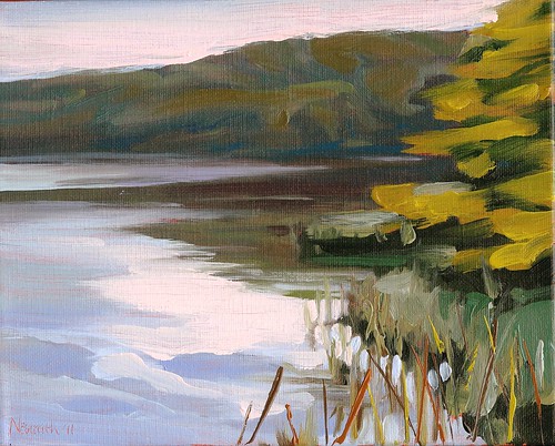
Sunrise Hwy 175
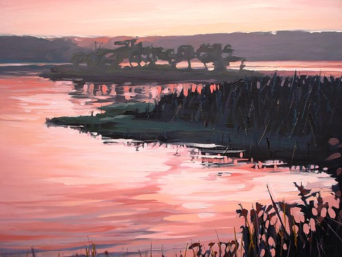
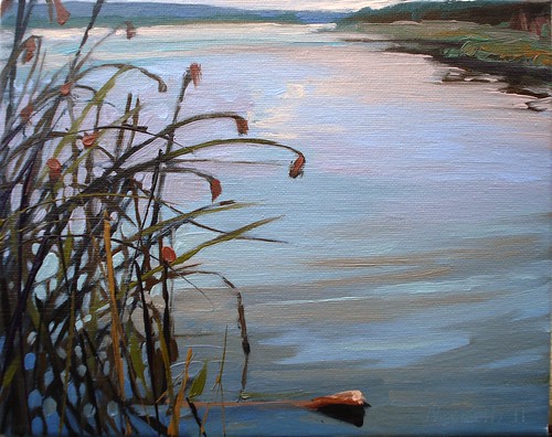
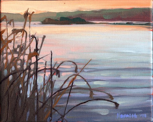
Through the Reeds
Thursday, January 13, 2011
Too Real/Not Real Enough
One of the key questions that all representational artists have to face is how "realistic" we want our paintings to be. Most people equate realism with a photograph, and the general viewing public often uses the phrase "it looks just like a photograph" as a compliment. Many painters take it as an insult. I think answering the question of realism is one of the defining aspects of an artists' style, and it's a question that all of us must answer on our own. My own work often hovers the fine line of realism, but I am not interested in description alone.
Take this painting for instance, arguably one of my more realistic oil paintings. When you actually take the time to examine the picture you find there's really very little in the way of details. The foliage of the tree is rendered in two or three large masses of color, the ripples of the waves are freely handled brushstrokes. I don't try to indicate a leaf or a blade of grass. There's really very little need to. Our vision is not merely a function of our eyes. When we view something our mind acts as a filter, interpolating and extracting much more (or less depending on the needs of the situation) than our eyes can see. We bring a whole history or prior experiences and knowledge to everything we view.
Rather than getting caught up in the quest for realism, I seek to express my experience of a place. I try to filter through my memories and observations and seize on the features that made the deepest impression on me. I encourage everyone I meet, artists and non-artists alike, to try to view the world around us with more than just our eyes. I think there's much more beauty to be found when we look with our hearts and our minds.
The Question of Style
"Approaching Storm" started out as a fairly gentle painting of a still evening on Lake Mineral Wells. After I had drawn the basic composition and layed in my initial colors, my wife came next door to my studio and told me my aunt had passed away. She'd been in the hospital all day, but when I'd spoken with my cousin earlier that afternoon it sounded like she was improving a little. When I finally returned to my painting later that night, my mood had certainly changed, and that change is reflected in my painting. My brush strokes became bolder, more aggresive, and the colors took on a slightly more somber tone. It's not a violent painting by any means, but by letting my mood and emotions flow through me and onto the canvas, it reveals a little piece of my grief, and in the process, a little of my style.
Visual Rhythm
Color Cousins (fitting the color to the mood)
We humans perceive color in very subjective terms. Perhaps more than any other element of art, color has the ability to not only set the mood in a painting, but to illicit a mood change in the viewer. There's lots of color schemes that artists use in their paintings: complimentary, triadic, split-complimentary, monochromatic, and of course, analagous. Some painters utilize color theory in an exacting manner, and some artists swing the pendulum to the extreme oppositte and use their intuition alone, a sort of fly by the seat of your pants approach. I find that often the best results lie somewhere in-between.
I started this painting thinking about the calm evenings my family and I shared this past summer at Lake Mineral Wells, when the heat of the day would dissipate and a cool breeze would roll across the water. I wanted to capture the contented feeling I had after a long day of hiking with the kids when we'd sit by the shore and watch the water and the sky. Many of my paintings feature the spectacular warm yellows, oranges, and reds of the early morning or late evening sky, but I decided a cooler pallete would better serve the mood I was after in this painting. I loosely planned on what some would call an analagous color scheme. An analagous color scheme (say that fast three times) is one that uses colors that are beside each other on the color wheel. I like to think of analagous colors as cousins, they're close to each other and have some blood in common, but they're in different families. Like cousins, our built in playmates for life, analagous colors have a kind of built in harmony. They get along nicely in a painting to create an easy harmony. While this imposed limitation of colors might seem boring to some, varying the intensity and value of the colors can add alot of interest while staying true to the harmony.
This painting is based on blues and greens, but during the course of the painting I felt a few accents of slightly warmer colors would increase the sense of space and atmosphere. I added slight amount of orange to some of the lighter green areas, and some of the darker blues are pushed towards a violet. The distant shore became a deep, dull red. These additions were intuitive, but adding them suddenly brought the blues and greens to life! I think color theories are informative and I certainly learned a great deal as a young artist about the many ways colors interact by exploring color theory in a quasi-scientific manner (we went through the Munsell book in college,) but I think we have to also trust our eyes and our intuition when it comes to art. As artists, we're not after a perfect formula. We're after that extra little something that touches another human being.
The Extraordinary Ordinary
Like most landscape painters, I love the early morning and late evening light for their spectacular colors, warm tonality, and unifying effect. With amazing sunrises and sunsets everyday, sometimes it's tempting to only paint during those times. Sometimes I have to remind myself that there's beautiful light around us all day long. I think the afternoon with its contrast of blue sky and light clouds and full, green foliage can sometimes be a little more challenging to paint. Everyone thinks a sunset is spectacular, but not too many people notice what's around us the rest of the time. This is a view along the shore at Lake Mineral Wells in the afternoon. I think the viewpoint adds to the interest, as does the sky mainly appearing in the water. To tame down the green of all that foliage, I tried to introduce subtle hints of violets and dull reds and pinks. The clouds themselves are a very lightly tinted pink. While the color here is not as spectacular and over-the-top as it would have been later that evening, I think there's something to be said for the subtle beauty and reflective quality of my afternoon stroll along the lake.
Unexpected Beauty in a Roadside Ditch - NEW Water Lily Painting in Progress by Mark Nesmith
Here’s the view from my easel today. I drew up a couple of large views or water lilies from the drainage ditch past Winnie on the way to ...

-
 Caprock Canyon By Mark Nesmith Oil on Canvas 12” X 16” 2020 CLICK to bid in the auction or buy it now. It’s been a few ye...
 -
 Like many artists these days I find myself trying to make the most of my small studio space. While I lived in North Texas I was kin...