Thursday, January 13, 2011
Color Cousins (fitting the color to the mood)
We humans perceive color in very subjective terms. Perhaps more than any other element of art, color has the ability to not only set the mood in a painting, but to illicit a mood change in the viewer. There's lots of color schemes that artists use in their paintings: complimentary, triadic, split-complimentary, monochromatic, and of course, analagous. Some painters utilize color theory in an exacting manner, and some artists swing the pendulum to the extreme oppositte and use their intuition alone, a sort of fly by the seat of your pants approach. I find that often the best results lie somewhere in-between.
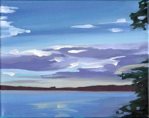
I started this painting thinking about the calm evenings my family and I shared this past summer at Lake Mineral Wells, when the heat of the day would dissipate and a cool breeze would roll across the water. I wanted to capture the contented feeling I had after a long day of hiking with the kids when we'd sit by the shore and watch the water and the sky. Many of my paintings feature the spectacular warm yellows, oranges, and reds of the early morning or late evening sky, but I decided a cooler pallete would better serve the mood I was after in this painting. I loosely planned on what some would call an analagous color scheme. An analagous color scheme (say that fast three times) is one that uses colors that are beside each other on the color wheel. I like to think of analagous colors as cousins, they're close to each other and have some blood in common, but they're in different families. Like cousins, our built in playmates for life, analagous colors have a kind of built in harmony. They get along nicely in a painting to create an easy harmony. While this imposed limitation of colors might seem boring to some, varying the intensity and value of the colors can add alot of interest while staying true to the harmony.
This painting is based on blues and greens, but during the course of the painting I felt a few accents of slightly warmer colors would increase the sense of space and atmosphere. I added slight amount of orange to some of the lighter green areas, and some of the darker blues are pushed towards a violet. The distant shore became a deep, dull red. These additions were intuitive, but adding them suddenly brought the blues and greens to life! I think color theories are informative and I certainly learned a great deal as a young artist about the many ways colors interact by exploring color theory in a quasi-scientific manner (we went through the Munsell book in college,) but I think we have to also trust our eyes and our intuition when it comes to art. As artists, we're not after a perfect formula. We're after that extra little something that touches another human being.
Subscribe to:
Post Comments (Atom)
Unexpected Beauty in a Roadside Ditch - NEW Water Lily Painting in Progress by Mark Nesmith
Here’s the view from my easel today. I drew up a couple of large views or water lilies from the drainage ditch past Winnie on the way to ...

-
 Caprock Canyon By Mark Nesmith Oil on Canvas 12” X 16” 2020 CLICK to bid in the auction or buy it now. It’s been a few ye...
 -
 Like many artists these days I find myself trying to make the most of my small studio space. While I lived in North Texas I was kin...
No comments:
Post a Comment