Wednesday, July 27, 2011

Caprock Afternoon


Caprock Afternoon, originally uploaded by Mark Nesmith.

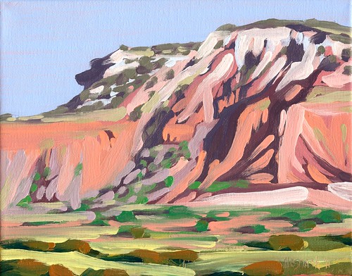
This is a small oil painting of a hot afternoon at Caprock Canyon. I've been doing a few paintings off and on of my trip there last summer (I keep getting distracted with other subjects--Texas just has so many wonderful vistas to paint!) I'm trying to work out capturing the blistering hot sunlight at Caprock in the summer when the incredibly vivid colors of the bluffs start to seem kind of bleached out. If you ever plan trip to Caprock Canyon State Park in the summertime, make sure you pack plenty of water, sunscreen, good walking shoes, and a wide brimmed hat (and the strongest bug spray you can find - the deer flies are notoriously big and love to bite!) Outside of our tent there was very little shade, especially once we started to hike up the mountains. Don't get me wrong, the canyons are beautiful anytime of year, but I think my next trip there will be in the Fall or Spring. Much cooler temperatures, and the cactus will be blooming. This painting is 8" x 10" and is oil on canvas.

Thursday, July 14, 2011

What's in a pallet anyway?

I've had a couple of questions about my pallet, brushes, medium, etc., and while I wish I had some amazing story to tell, I'm really a pretty simple guy when it comes to paint.  The picture above is of my setup.  I'm using a plain old piece of glass on top of a set of plastic strorage drawers with wheels from Wal-Mart.  I've always used glass because it's easy to clean even when I leave paint sitting for too long (guilty as charged), and the plastic drawers were a cheap way to get the pallet waste high and have some storage for brushes, paints, and other supplies.  I've been using Utrecht or Daniel Smith paints, although I'm fine with just about any brand as long as they have good pigmentation.  I'd love to try Williamsburg paints but that'll have to wait for my lottery winnings to roll in!  Ha!  As far as colors, I stick pretty much to basics.  Starting in the bottom right hand corner of the photo and moving clockwise there's Titanium White, Naples Yellow, Cadmium Yellow Light, Cadmium Orange, Cadmium Red, Alizarin Crimson, Ultramarine Blue, Viridian, and Pthalocyanine Green.  I'm thinking of adding a few colors, probably starting with Cobalt Violet, but for oil painting I really prefer to keep it simple and mix any colors I need.  When I need black (or rather something close to black) I mix it from Alizarin Crimson and Pthalocyanine Green. That way I can push it towards the red or green spectrum depending on the needs of a particular painting.  I try to have no more than three colors in a mix (the first two get me in the right hue family, and the third is for tints and shades.)  I pretty much stick to bristle brushes and have an assortment of flats and rounds, although recently I'm using the rounds for most of my work.  My medium is a traditional mixture of damar varnish, stand oil, and turpentine.  I mix up large batches at a time and then fill small squeeze bottles to keep on my work table.  For my first layers of painting I use a 1:1:3 ratio (oil:varnish:turps) and then a fatter 1:1:1 for subsequent work.  After experimenting for many years with different techniques and mediums (including alkyds and acrylics) I've pretty much returned to the materials I used in my first painting classes with at Lamar with Larry Leach (a FANTASTIC painter and teacher and my first real mentor.)  I've still been painting on gesso primed canvas that I tone with acrylic paint, although I'm kind of itching to try some primed birch panels again.  Larry recently told me about Winsor's Artists Oil Painting Medium and I'm planning to check that out as soon as I'm out of my current batches of medium.  That's about it, pretty simple I think, especially considering that I've met painters who keep dozens of colors on their pallet.  For me I tend to find that less is more, and after all these years I've come to believe that painting has more to do with how you see and feel than what you use.

I'd be interested to hear what you all consider to be "must have" items for your paint box.

Friday, July 8, 2011

Texas Sky, Lake Mineral Wells (Crosstimbers Trail)

Here's a lesser known side of vacationing at Lake Mineral Wells State Park. On the North side of the lake, the Crosstimbers Back Country Trails offers hiking, biking, and horse trails that take gentle to moderate slopes through grassy hills and woods.  Some are partially paved but most are gravel/dirt combinations. The area was a training ground for chopper pilots during Vietnam. There's a few small memorials of soldiers who served, and lots of clearings that were used to train the pilots to airlift soldiers in and out of combat. After a day of hiking the rocky and more rugged trails around the lake, my family and I often hike these trails in the evening and watch, awestruck, as the sun begins it's descent and the woods give way to beautiful expanses of Texas sky. This is a 12" x 16" oil on canvas painting, and I have to honestly say that the colors are much more vibrant and beautiful in person.

Tuesday, July 5, 2011
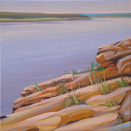
On the Rocks


On the Rocks, originally uploaded by Mark Nesmith.
One of the things I love the most about traveling in Texas is the wonderful variety of landscapes. Where else can you go from beaches to pine forests to rolling hills and desert canyons without crossing state lines?  Often a single location offers a multitude of landforms. In the last year I've painted lots of pictures of Lake Mineral Wells. Most have focused on the wooded shores with their rhythmic grasses growing out of the water, but there's much more to see at this state park. One side of the lake is a rock climbers dream. There are caves and cliffs to explore that are an easy to moderate climb. My kids have a wonderful time acting like mountain explorers, and for the skilled climbers there are even permanent anchor spots for ropes at the top of the scenic outlook for repelling. There are many hiking trails that explore this side of the lake, and the shoreline of Lake Mineral Wells is dotted with these wonderful boulder outcrops that make perfect resting places when you're tired or just want to relax and contemplate the view. The inspiration for this painting was an early morning hike when the lake was calm and the sky was just starting to take on a soft glow. At one time I was very into square paintings, and every once in awhile I still enjoy returning to this format. This painting measures 12" x 12" and is an oil painting on canvas. If nothing else, I hope my artwork inspires you to look to the wonderful beauty of Texas and consider exploring some of our state parks for your next vacation.

Monday, July 4, 2011

Choppy Day on the Lake


Choppy Day on the Lake, originally uploaded by Mark Nesmith.

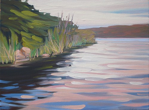
This is one of the larger paintings I've been working on lately. It's 18" x 24" and is oil on canvas. I wanted to give the feeling of those light filled, breezy days on the lake with the sounds of the waves lapping against the shore. I've tried to keep the loose, painterly feel of my smaller pieces, and have been resisting the urge to go back and clean up some of the waves. I actually went and bought a couple of larger round, bristle brushes (a 10 and a 12) to help keep me from tightening up on these larger canvases. This was painted in two main sessions, with a little additional time spent evening out a couple of transitions in the water. Kind of funny, I used to paint really large pictures (3 or 4 feet was SMALL back then), but now I'm painting smaller and smaller. When I do approach a little bigger format, I'm really aiming to have the look and feel of my smaller scale paintings. Go figure!

Unexpected Beauty in a Roadside Ditch - NEW Water Lily Painting in Progress by Mark Nesmith

Here’s the view from my easel today. I drew up a couple of large views or water lilies from the drainage ditch past Winnie on the way to ...